top of page
HEALHUB
/Timeline
3 weeks
A design exploration into how band-aid packaging can be reimagined for smarter use and everyday accessibility.

/Tags
Structural &
Surface packaging design
Who is it for?
For families, active individuals, workplaces, and healthcare spaces or anyone who needs quick, reliable, and accessible care.
Why this project?
To explore how a soft-selling, small and overlooked product can be made more functional and engaging through design, turning a simple band-aid into a thoughtful brand experience.
What is HEAL HUB?
A conceptual first-aid brand that rethinks band-aids with smart, dispenser-style packaging and a clean, modern identity.

Won 2nd runner-up in Battle of Projects '24
by ADI.

What's out there?
Most band-aid packaging in the market feels monotonous - boxy structures with little variation. While some brands experiment with playful visuals for kids,
while adult and medical-grade range often defaults to cold, overly clinical designs.
This gap opened up an opportunity: to explore packaging that stays intuitive and functional, yet feels warm and welcoming in the above range!
Little Things That Hurt
These frustrations may seem manageable, but they opened up space for me to rethink and design packaging that’s truly functional and user-friendly.
Unclear instructions
The label has no distinct or attention
grabbing instructions on how to
unpack a band-Aid, so people end
up missing it and get confused.
Doesn't tear easily
To prevent from contamination, the band-aids are sealed and packed tightly closed which then doesn’t tear easily when needed.
Inconvenient packaging
Band-aids usually come in either a water -
resistant box or a plastic jar, or sometimes only sachets which prolongs the time to fetch 1 band-aid from the box.
Refining the form
Initial explorations focused on form and usability, gradually evolving into a concept that felt both intuitive and inviting.


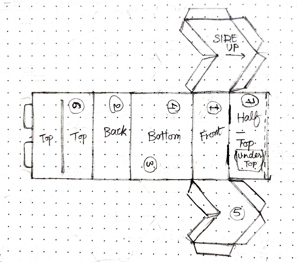
Well now if you want to check
out more iterations and KLD,
here you go Documentation.
With the structure in place, it was time to bring the surface to life - shaping the brand’s visual identity and packaging cues.

Organized | Approachable | Memorable
HealHUB’s visual identity is minimal, organized & informative on the small surface, yet playful through its colors and medical-inspired patterns. The logomark reflects the box’s structure, emphasizing its unique form.

Logo
The arrow in the plus icon
is taken from the side-view
of the packaging box.
Typeface
MUNDIAL Regular 8 pt
Mundial Light 6 pt
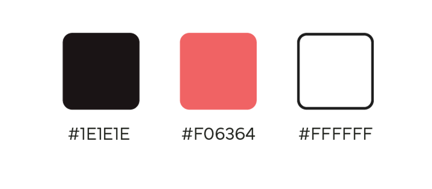
Colors
What sets it apart?
The box isn’t just about looking clean- it’s built to be simple based on the familiar idea of dispensing tissues.
Easy & smart dispensing

Refillable for upto 2-3 sets
.png)
Neatly stackable for compact storage, at home or in the first-aid box


What I faced
Turning user frustrations into feasible solutions was a real test; it demanded multiple iterations.
Another challenge was to fit all the information & branding on such a small surface area, yet make it stand out on the shelf and seamlessly blend into the user's everyday life.
Feedback
Prof. Suchit Ashtekar
What I learned
This project showed me how design can ease small, everyday frustrations. Packaging isn’t just a container - it’s a system that should blend seamlessly into users’ lives.
I also learned to balance function with form. While exploring structures and visual identity, I realized that even the most functional design won’t succeed if it doesn’t feel approachable or intuitive.
bottom of page