top of page
ASTRO MAGAZINE
/Tags
Publication design
This astro-magazine named 'Twinkle' orbits around the wonders of space and imagination, blending visuals and stories from the cosmos in an experimental layout.

/Timeline
3 weeks
Filling the void
Most space publications lean on heavy jargon and dense layouts. This one sits in between blending design, storytelling, and wonder to make space exploration approachable without losing its sense of awe.
Why space, why now?
The fascination with stars and galaxies is timeless, but often feels out of reach.
I chose this theme to bridge curiosity with creativity, turning complex cosmic ideas into an engaging and accessible discovery experience.
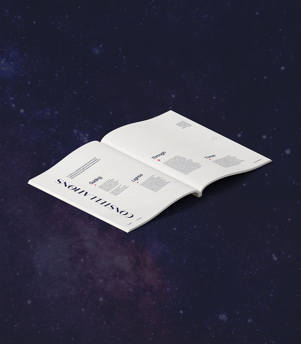
Mapping the cosmos
This publication explores the cosmos through typography and constellation-inspired layouts. Instead of heavy visuals or illustrations, it relies on type and minimal imagery to immerse the viewer in each spread like an element floating in the vast, quiet space.
Mapping the mood
The moodboard sets the tone - pulling from the quiet vastness of space, the geometry of constellations, and the elegance of type. It captures the balance of minimalism and curiosity that guided the design language of the magazine.

Pagination
The initial round of sketches and layout was based on a 2-column grid with images stacked alongside the text or bled through the entire spread.
However, this appeared too compact when I started working on the spreads and didn't rhyme with the feeling of discovering and floating in space.
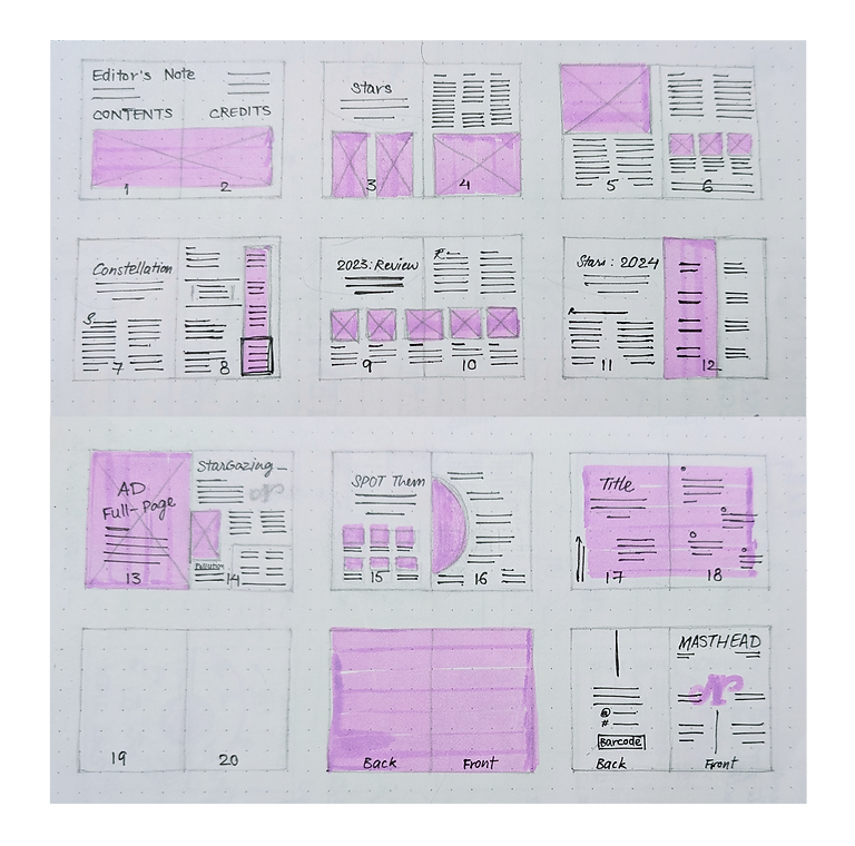

Re-orbiting
And the first round never saw the light of day! This time, I focused more on layout experimentation, testing different approaches to spacing, typography, and constellation-inspired elements.


Column Grid
I decided to go with a 7-column grid to break text into smaller, digestible chunks while supporting the scattered-in-space visual style. The outermost (7th) columns on each side are reserved for marginalia, providing contextual notes without interrupting the main narrative.
Margins: Top 15 mm | Bottom 20 mm
Margins: Outer 10 mm | Inner 12 mm
Gutter: 4 mm
Display type
Coolvetica Sans-serif
Sloop medium Script
Domaine display Serif
Sub-heading
Neue Montreal regular 12 pt/ 14.4 pt
Body copy
Lora regular 9 pt/ 11 pt
Marginalia
Lato italic 8 pt/ 9.6 pt
Type Hierarchy
What a variety we have here! Apart from the sub-heads and body copy, I assigned a dedicated font for the marginalia for it to not interfere with the main content.
For the Display type, I ended up including one in each category to have different font pairings, for every spread's layout and content is unique.
Let's have a look now.
Now let's scroll through the star-field!


Noticed these orbit style page numbers only on right pages?
Flip through the pages to spot them all


Want more stargazing? View the full magazine here


Challenges in orbit
Balancing science-heavy content with an engaging visual flow was no easy task. Another challenge was maintaining consistency while experimenting with scattered layouts. Each spread had to feel free, yet part of the same cosmos!
Feedback
Prof. Bappa Das
Nikhil Ranganathan
Takeaways from the stars
This publication showed me how design can balance structure and imagination. The column grid held the scattered-in-space vibe together, pushing me to rethink commercial magazine layouts and experimenting with each spread.
In the end, it felt like an extension of my ex-libris (on the home page).
bottom of page